Blenders Logo Makeover and a New Product Launch

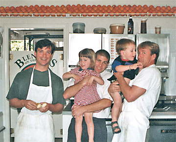
The year was 1994 and three long-time friends, Scott, Keric and Art (left) had done some research and determined that healthy fruit smoothies were catching on, especially with younger folks. They decided to look for a college town on California’s Central Coast that didn’t already have a smoothie shop. Blenders in the Grass opened it’s doors in the Spring of 1995 in Isla Vista, California, the town built around UCSB, with the good friends now partners in a fledgling business adventure.

What started out in that tiny location in Isla Vista has grown to a 15-shop operation that now stretches from Orcutt to the north all the way south to Camarillo. We started working together about 15 years ago on menu boards for their Santa Barbara and Ventura locations. They had used dark green and orange vinyl lettering on white boards and wanted a fresher, full-color look that was now possible with inkjet-printed graphics.

We've had a great working relationship over the years so I was more than pleased late last year when they asked me to begin working on a logo update and a complete branding solution for a new category of smoothies they were bringing into their shops.

The Logo Update

Their original logo (right), three electric blenders, surrounded by grass and an older typeface was looking dated and a bit dull. Most customers had taken to shortening their name to just “Blenders”, so we decided it was time to brighten, simplify and modernize the brand identity.

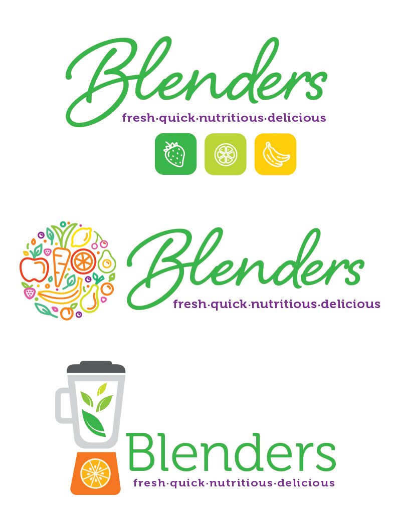
We had used a script typeface on the menu boards several years ago so we started working from there. We toyed with keeping the blender graphic but quickly realized that customers didn’t really care how you made the drink, they just loved the benefits. So we decided to incorporate a tagline we had used on the menu boards; Fresh, Quick, Nutritious, Delicious.

Next we choose to highlight the healthy ingredients, and even included one combination of a blender, fruit and veggies (left). The guys were pleased with these options but then we came up with the winner.

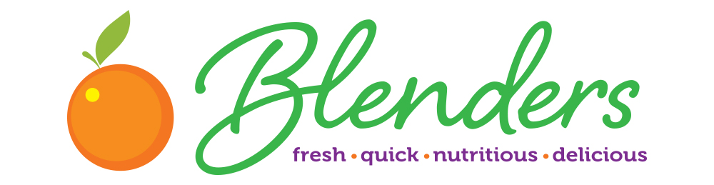
Keeping their primary color combination of green and orange, and using a simple but effective orange (the fruit) graphic we solved the problem to everyone’s satisfaction. The new logo has been rolled out on the cups, on signage in new store locations, on t-shirts, and on the website (which we also created and maintain).

A New Smoothie Product

As the smoothie market has evolved over the years, a quest for even healthier concoctions has emerged. In order to meet the new demand, Scott, Keric and Art teamed with local Registered Dietitian, Jennifer Tasca, MSRD to create six unique smoothies which they named Focused Health Blends. Each Blend is nutritionally-balanced with just the right combination of proteins, carbs and healthy fats and they are dairy-free, gluten-free and completely plant-based. They focus on weight control, workout recovery, detox, boosting antioxidants, better digestion, and reduced inflammation.

Our first order of business was the new brand mark. There would be a stand-alone menu poster in the stores that would have a vertical format so we tailored the mark for that. These smoothies are so unique because all of their ingredients come from plant sources so we built the mark around an abstract plant-like graphic. We tied the product to the new logo (above) by using the same typeface for the word Blend as we used for the word Blenders.

Next, we created the in-store menu poster and brochure. Again, we used the plant-based theme incorporating the large palm leaf supporting a crystal clear drop of water. The menu included the six product descriptions and their benefits.

The take-home menu/brochure goes into greater depth on the benefits of each smoothie and introduces Jennifer Tasca who helped create the blends. Download the brochure here>

Finally, we helped promote the new offering by creating in-store and window posters. In order to promote the healthy look of the new smoothies in their clear cups, we photographed the very colorful blends and then created two versions of the poster using the new slogans: Blended Goodness for Every Body! and Healthy Never Tasted So Good!

When asked for some feedback on our work on these two projects the partners responded this way:

"We love working with Bill.  He takes the time to understand our Company culture and products and is essentially a partner in the process of creating any of our marketing pieces.

When we recently decided to introduce our new category of smoothies (Focused Health Blends), Bill met several times with the nutritionist who helped us design them, and he was instrumental in the naming and logo design for the category.  We are very happy with the results and the new smoothies are selling very well. He is open to suggestions, talented, and creative.  We have a 15-year relationship with Bill which is indicative of how valued he is by the three of us."

The praise is much appreciated! It was a very fun group of challenges to solve and it's always a thrill to drive by the stores and see the posters in the window or see the new logo on the cup in someone's hand, enjoying a fresh, quick, nutritious and delicious smoothie from Blenders! Congratulations on your continued growth and success—you are a Central Coast fixture we're all lucky to have.

BTW, we couldn't have gotten through these projects so successfully without the help of Glen and the gang at Color Services who built all of our menu boards and posters with care and perfection!

Posted in marketing, rebranding.

Created 26 years ago by Bill Schoneberger, Clear Concepts specializes in affordable and effective marketing communication design and photography projects for small businesses.